Is economic inequality growing?
Richard Tonkin explains how ONS is measuring income and wealth.
Is the gap between the richest and poorest really becoming wider? Is wealth concentrating itself in fewer hands? Important questions on perhaps the most contested issue in economics.
Unfortunately, a quick search of the Internet may leave you a little confused as to the answers, with some writers saying the evidence shows that inequality is rising, whilst others are equally insistent the data point towards falling inequality.
Collecting accurate data on household income and wealth across the distribution is very challenging, but vital for properly measuring levels of inequality and how it changes over time. At the moment, UK income and wealth distribution statistics are based largely on household surveys, including the Living Costs & Food Survey and Wealth & Assets Survey carried out by ONS, as well as DWP’s Family Resources Survey.
These surveys are carried out in line with international best practice, and some aspects are truly world-leading. However, no data source is perfect and we know, for example, that surveys on their own are less good at measuring the very top of the income or wealth distribution, although there are various adjustments that can be applied to the data to account for this.
At ONS, we’re currently working on transforming our data on the distribution of household finances. Part of this will involve linking data from administrative and other non-survey sources, of the type Jonathan Athow mentioned in his recent blog including HMRC Real Time Information (RTI) and DWP benefits data. These other sources have their limitations too, but by using them together with surveys we should be able to produce even better data on household income and wealth. There’s lots more going in this area at the moment, and I’ll hopefully write another article focussing specifically on these developments soon.
However, at the moment, while these surveys are very good at telling us about the overall distribution the best data source for the richest 1% (and 0.1%) are probably the estimates produced by Sir Tony Atkinson for the World Top Income Database using data from ONS and HMRC, which I’ve charted below.
What do we mean by income and wealth?
Household income is all the economic resources that come into a household on an ongoing basis. This includes wages and salaries and income from self-employment, but also other sources such as savings and investment, rental income and private pensions. It also includes all the income that household members might receive from benefits such as Job Seekers Allowance, Child Benefit and Tax Credits. The state pension is also included as a cash benefit.
The total income from all these sources for the whole household is known as their gross income, with the total excluding cash benefits called original income. Another common measure of income is disposable income, which is equal to a household’s gross income minus the amount they pay in income tax, employee’s NI contributions and Council Tax (or rates in Northern Ireland). Disposable income is an important measure as it represents the amount a household has for either spending or saving.
Household wealth is the total value of economic resources that a household holds at a point in time. In measuring the total wealth of a household we measure 4 components:
- Net property wealth, which is the value of the main residence for a household plus that of any additional property they may own, minus the value of any mortgages.
- Physical wealth, which is the value of the contents of the household’s main residence and any other properties, including collectables, valuables, vehicles and so on.
- Net financial wealth which comprises financial assets held by members of the household (such as savings accounts, stocks and shares, and money saved at home), and any financial liabilities (such as overdrafts, personal loans, and arrears on household bills).
- Private pension wealth which represents the value of occupational and personal pensions accumulated by members of the household.
Most of the time, people with high levels of wealth tend to have high levels of income (and vice versa), but that’s certainly not always the case. For instance, some young people might be on high levels of income but have yet to accumulate comparably high levels of wealth, and conversely some retired people may have relatively low incomes but high levels of wealth.
How has income inequality been changing?
There are a number of ways in which income inequality can be presented and summarised – this could be the subject of another blog on its own! One of the most commonly used is the Gini coefficient, which I’ve presented below for some different income measures. The Gini can vary from between 0 and 100, with 0 indicating complete equality and 100 the opposite, with one household holding all the income.
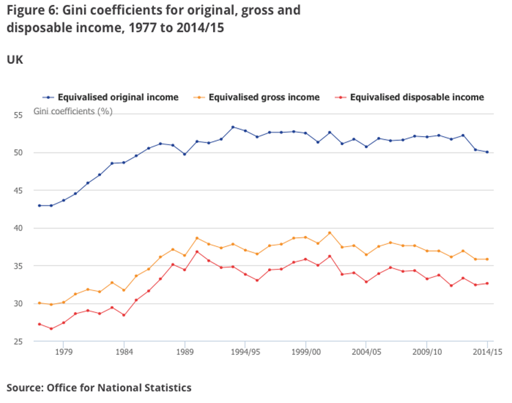
This chart helps highlight how the story about what’s happening to inequality depends on the time period you’re interested in. Looking at inequality of disposable income, in recent years, income inequality has fallen slightly, with the Gini falling from 34.7% in 2006/07 to 32.6% in 2014/15.
However, if you take a longer term view, you can see that income inequality remains well above the levels seen in the late 1970s, although the recent downward trend in inequality means it is back down to the levels seen in the mid to late 1980s on this measure.
Hopefully you can also see that although the broad trend in the Gini for the 3 income measures is similar, the exact pattern varies across the series. For example, inequality of original income grew quite rapidly during the early 1980s, but the other measures were relatively stable. These differences tell us something about the impact of taxes and benefits on inequality. If you’re interested in finding out more about this topic this article is a good place to start.
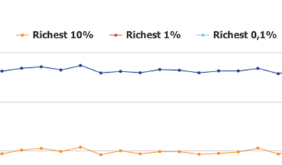
What about the 1%?
The Gini coefficient takes into account the whole distribution, but a lot of the time, there’s particular interest in looking at the incomes of the very richest and how they relate to the rest of the population.
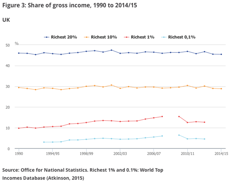
The chart shows the gross income shares of the richest 20%, 10%, 1% and 0.1%. From this you can see that any changes in the income share of the richest 10% or 20% have been relatively small since the start of the 1990s. By contrast, the income shares of both the top 1% and 0.1% steadily increased for much of the time through to 2007/08 meaning increasing inequality over that time when the focus is on the very richest.
Between 2009/10 and 2010/11, there was a sharp fall in the income share of the richest 1% (and 0.1%) implying greater equality, with the share remaining broadly stable in the following years.
What’s happened to wealth inequality?
Household wealth is more unevenly distributed than income. This is in some ways unsurprising – even if all households received the same income, wealth inequality would still exist as those who are older (and therefore receiving an income for longer) would likely have accumulated more wealth through saving.
There isn’t the same long time series for wealth inequality as there is for income: Our main source of data on the distribution of wealth, the Wealth and Assets Survey first started in 2006. That data shows a slight increase in inequality of total wealth between 2010/12 and 2012/14 based on the Gini coefficient (up from 61% to 63%), having remained largely unchanged in the previous years.
Like so many others, that story becomes more complicated once you dig between the surface: Have a look at our Wealth in Great Britain report to find out what’s been happening to inequality for the different components I mentioned above.
This is a huge topic and although I have only scratched the surface in this post I hope it’s an interesting introduction to the subject and the work we’re doing around it at ONS.
Richard Tonkin is Assistant Director of Well-being, Inequalities, Sustainability & Environment at ONS . Follow him on Twitter
Feedback to the Editor