Inequality: are we measuring the right things?
One of my colleagues wrote an interesting blog on inequality a few months’ ago, explaining that the evidence we have suggests that inequality in terms of income has been flat or falling in recent years. This is contrary to many people’s perceptions. So what is going on here?
At the moment, it might be tempting to think this is the result of the social psychology around what people believe to be true. For example, do people have ‘confirmation bias’ that means they tend to ignore evidence that disagrees with their prior beliefs? Or alternatively at a time when incomes have not grown strongly, do people associate the modest gains in their own income with increasing inequality?
These are all good points, but I want to explore some other explanations. In particular, we should ask the question of whether we are measuring the wrong thing?
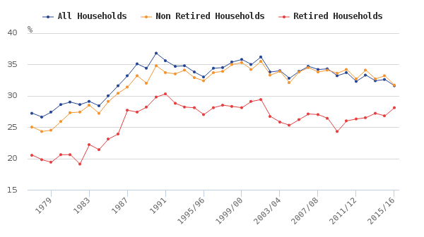
Firstly, any set of statistics – and the data sources underpinning them – will have strengths and weaknesses. We always need to put our data in context of others. The main alternative data source to our inequality statistics is the Households Below Average Income statistics published by the Department of Work and Pensions. That tends to show broadly the same pattern in household income over time, so we should have a reasonable degree of confidence in our statistics.
Secondly, is the metric we are using the correct one? Inequality is not necessarily an easy concept to quantify. The most commonly used measure is the Gini coefficient, which looks across the whole population. But there are other measures that look at inequality in a different way, for example, worrying about inequality at the top or bottom of the income distribution. We can probably rule this out as an explanation in this case as a wide range of measures tend to show falling income inequality. But we can completely never discount the idea that there might be some particularly salient aspect of inequality that our measures do not fully capture.
Thirdly, inequality in what? The figures we publish relate to inequality in income. But maybe it is inequality in wealth that is relevant here. The statistics on wealth are less strong than income – reflecting in part that wealth is often more difficult to measure. The data we do have only covers the eight years from 2006 to 2014. This does suggest a small rise in the very recent years, but it is very difficult to draw any form conclusions from this data as the early period might well have been affected by the financial crisis.
The issue might be more profound than income or wealth inequality. Rather it might be a concern that of inequality in life chances. By this I mean that individuals born into lower income or wealth families have less opportunity to move up the ladder, compounding the effects of low income or wealth. Another way of saying this is that falling social mobility might make existing inequality feel more pernicious. Evidence on social mobility is much more sparse as to get a complete picture you really need to follow individuals over a good proportion of their life. The Social Mobility Commission present some evidence to suggest that inter-generational income mobility has declined, though much of the evidence focuses on trends in the latter half of the twentieth century rather than more recent changes. Broader measures of recent social mobility provide a mixed picture.
Fourthly, our data cover the UK, but it might be that inequality issues do not stop at national boundaries. If, for example, you read about a Brazilian footballer leaving the Premier League to earn millions of pounds a year playing in China, that might make you think inequality is worsening. But this is nothing to do with UK inequality. It is very difficult to provide a global measure of inequality, as comparable income data are not available, so it has to be estimated. A few people do try to look at statistics globally, and a good summary is provided by Max Roser. This shows measures of poverty and deprivation have been falling strongly across the world, and that inequality is falling, though remains high.
It is not clear to me that any of these are particularly compelling, though they might all play a part in explaining why people might disagree on trends in inequality. Perhaps the moral of the story is to make sure as statisticians we are always alive to what our statistics measure and that many of the issues we try to grapple with are often complex and multifaceted. The key is always to understand the question you are trying to answer and how well your data or statistics are up to the job.
Some of the changes we’re making to our data on household finances at ONS will leave us better able to consider some of these questions in future. In particular, greater use of admin data alongside existing surveys should increase our ability to look at the top and bottom of the distribution; a move towards integrating surveys on household finances will allow us to look at inequalities in people’s income, spending and wealth together; and increased availability of longitudinal data will facilitate analysis of how material living standards are changing for the same people over time.
These changes are starting in the data we’re currently collecting for 2017, and one of my colleagues will be blogging later in the year to explain what they will mean for ONS analysis and how they will benefit anyone with an interest in better understanding what’s happening to economic inequality in the UK.