Mind the gap: why the UK might not be the most regionally unequal country

The relative prosperity of our nations and regions has been under scrutiny again with claims that the UK’s regional inequalities are among the world’s most extreme. But when our regional divide is compared with those of other countries it’s often a case of not comparing like with like. Here Richard Prothero shows how best to approach the data – and some traps to avoid.
Most estimates of regional inequality are based on measures of either income or economic output. From this starting point, the difference between a good or bad measure will then usually depend on how two potential pitfalls are addressed.
Firstly, people do not always live and work in the same place. Commuting can distort the picture if we measure economic output (GVA) per resident. Take the extreme example of the City of London with its resident population of less than 10,000 but where commuting means hundreds of thousands come to work every day. The resulting output per resident total for the City of London is huge, but essentially meaningless. It provides neither an accurate measure for the economic productivity of the area or for the household incomes of its residents.
In many parts of the country, commuting takes place within the locality so the effects are small. But in places like London, the effects can be large. For this reason, in most cases, we do not recommend using the GVA (or GDP) per head measure for economic performance or inequality comparisons.
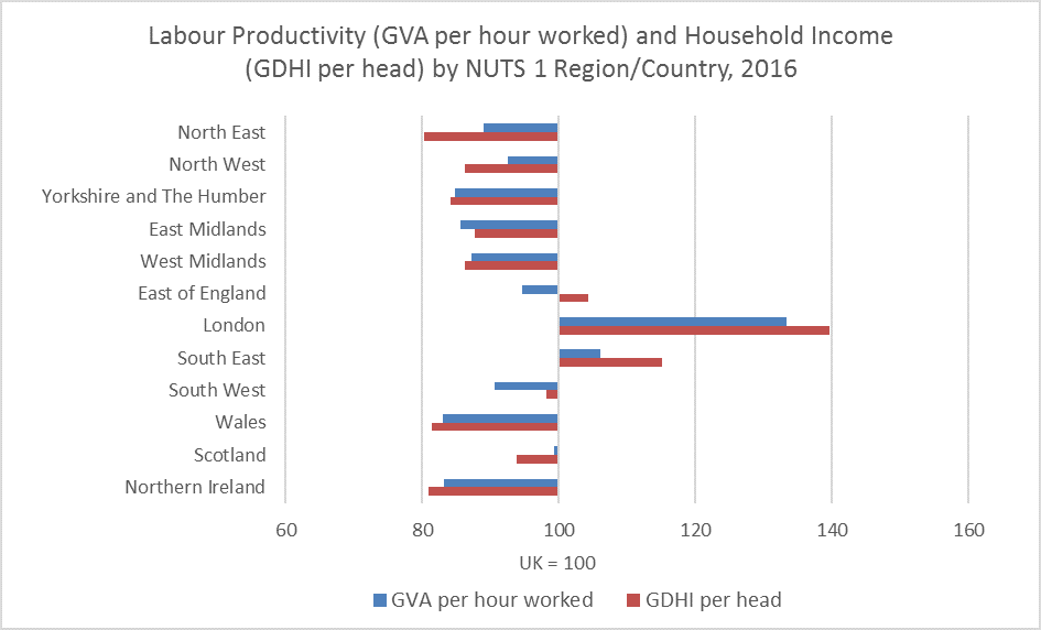
Instead of using GVA per head, we instead recommend using metrics that directly measure productivity (GVA per hour worked) or household incomes (gross disposable household income per head). Doing both enables an understanding of both the economic performance of firms located in an area (via the productivity measure) and a broad measure of the economic welfare of residents in an area (via the household incomes measure).
Figure 1 shows these two measures for the regions and countries of the UK. Often there will be a strong correlation between these two metrics, but not always. Commuting and demographic structure mean that sometimes areas are home to relatively prosperous residents despite relatively low economic productivity; or the opposite can be true. Examining both metrics can help bring these cases to light.
The second problem is that geography matters, particularly if this leads to comparing very different sizes or types of area. This is particularly important when making international comparisons. To illustrate this point, let us consider Bishops Avenue in London. This road contains some of the most expensive houses in London, with prices measured in tens of millions. The average price of a house here would be astronomical. But if we took the wider area – say the whole borough of Barnet – the average would be much lower. The smaller the size of the geographical area, the more one is likely to see extreme results. This applies to measures of economic output and income as well as house prices.
When we compare UK data with that of ,say, France (using internationally agreed regional geographies) we find we are not comparing the same sized areas. In France, Paris is not separately identified, and you need to look at the wider Île-de-France, covering the Greater Paris area, which has a population of over 12.0 million. By contrast, in the UK, using the same so-called ‘NUTS 2’ geography, London is broken up into five areas each with a population between 1.1 million and 2.2 million. As we are measuring smaller units in the UK, this is likely to give you more extreme results and suggest higher regional inequality.
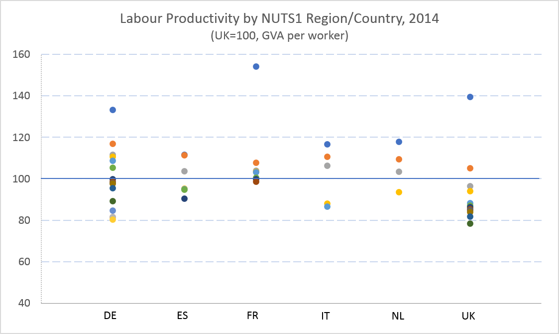
We recently published an article comparing UK regional productivity and incomes data with that of five major European countries with adjustments made to allow the comparison of regions with similar population sizes. The results showed regions of Paris and London had the highest productivity but many other UK regions had relatively low productivity levels (in line with southern Italy or eastern Germany).
Chart 2 illustrates some of this data showing a dot for each region in the six countries. Note that the relative performance of UK regions is slightly better when comparing disposable household incomes across regions with southern regions of Italy and Spain having lower average incomes than any UK region.
If we are careful with the choices of geography then, despite the warnings above, there can be times when GVA per head can safely be used for comparing regional economic performance. The key is to ensure that the geographical areas chosen have minimal levels of net commuting to negate the problems discussed above. This will usually mean using a geography created for this purpose that includes the wider commuting area. For example, the EU and OECD have developed statistics on metropolitan regions based on ‘functional urban areas’ that compare cities encompassing both their densely populated urban area with their commuting zones.
We will continue to develop our statistics in this important area and will publish more work in the coming months and years.

Richard Prothero is Head of the Centre for Subnational Analysis.