Thinking in multiple dimensions – The challenge of understanding ‘Flow of Funds’
As ONS updates its ‘Flow of Funds’ statistics, Richard Campbell explains how these new data are helping policy makers to see the build-up of risk in the financial system.
As the world gets more complex, so must our statistics. The more complex the statistics, the more we need to do to help people interpret and use them.
The latest Flow of Funds statistics are designed to improve understanding of how money moves in, around and out of the UK economy and to identify the build up of potential risk. For example, they let us understand who households are borrowing from and how much they are borrowing. This is something that we all need to understand, but the range of data and concepts involved makes this very complicated. With the latest publication we have done two things to help.
Firstly, we’ve improved the data and methods behind these statistics. Notably, we’ve increased the detail of the data through producing separate figures for the household and charities sectors, and for short and long term loans for the first time. These are important improvements as they enable better identification of areas of potential risk. With the use of new data sources – notably commercial data – there will be further big improvements to these statistics over the next year.
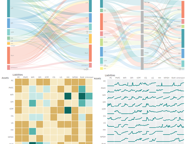
Visualisation
Secondly, we’ve improved the way we visualise the data to make it easier to understand. To paraphrase the famous saying, “If a picture paints a thousand words, a visualisation paints ten thousand”. To do this effectively, we need to consider the various questions the data will help us answer. In no particular order these are:
- Which sectors of the economy is money moving between?
- How is the money moving?
- How much money is moving?
- How does this change over time?
Any one of these questions can be graphed or visualised simply, but visualising all four at the same time is complex. There is no simple answer to this, but we have produced a number of innovative and interactive ways of combining and visualising these data which you can find here.
The value in doing this is that it helps users better understand the data. We would really welcome your feedback on which of these visualisations you find most useful and how we could make them more useful in future. Please drop us a line via FlowOfFundsDevelopment@ons.gov.uk.
Developing our Flow of Funds data, and how we present it, will take us some time, but this important work is already bearing fruit and improving our understanding of how money flows in, around and out of the British economy.
To learn more about Flow of Funds, please see our article here. For more information on how we developed our interactive visualisations, see our ONS.Digital blog.
Richard Campbell works on ONS’s Enhanced Financial Accounts initiative