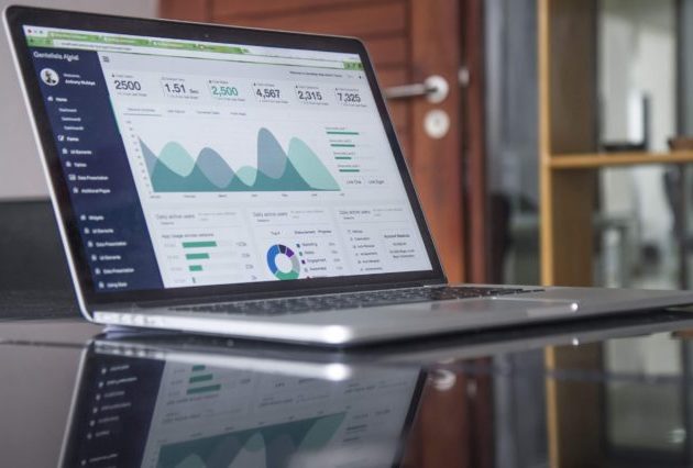
Don’t dash off – check out our Public Service Data Dashboards!

Each year the ONS and government departments publish data which provide insight into the efficiency of public services. When these datasets are viewed separately, however, it can be hard to understand the bigger picture. Now the ONS Efficiency Measurement Unit has developed interactive dashboards on the Government Statistical Service website which aim to bring together a range of data in one place. Here Sophie Davies talks us through the new dashboards and explains how they fit in to the wider work ONS is doing on public service efficiency.
Dashboards are quickly becoming a widely-used tool for many analysts and organisations. With more data available than ever before, a dashboard can be a great way to analyse and present data quickly, in an interactive and accessible format. A huge array of data exists to help build the picture of public service efficiency, released in separate publications by a range of public service bodies. As a result, conversations tend to be about which data to use as opposed to what messages we can take from the data.
At the Office for National Statistics, we are helping to build a firm evidence base for assessing the efficiency of public service delivery; to inform Government policy and decision-making.
As a result, we have produced four dashboards which bring together a range of existing public service data covering: education, health, criminal justice and work and pensions. Each includes information on spend, inputs, outputs and outcomes. By bringing it together in one place into an interactive tool, we hope to enable users, from departments and HM Treasury through to the public, to have a shared understanding of the efficiency story.
As National Statistician, John Pullinger, has said “there is real value in this work; bringing data together to cut through the noise and make sense of the world around us”.
To add value, we have also included extra information to help users understand the data used, by highlighting caveats and linking to underlying sources. We have attempted to provide an overview and starting point for those who wish to undertake further analysis but depending on the specific efficiency question, other data not included in the dashboard may be more appropriate.
Examples of what you might expect to find in the dashboards include teacher numbers, healthcare waiting times, housing benefit caseloads and criminal reoffending rates.
By drawing on wider sources of data, we are also developing a series of stories covering a range of efficiency related topics. The first two of these provide information on the characteristics of public sector workers and the productivity of the Fire and Rescue Services in the UK.
The dashboards are available here as experimental Beta versions.
Power BI’s performance varies across web browsers. We suggest trying an alternative browser if the dashboard does not load
To continue improving these Beta products, we invite users of the dashboards to provide us with feedback to inform the next stage of development.[1] We are continuously striving to improve the quality of these dashboards and would welcome feedback on how they are being used and what improvements we should consider for future iterations. We will use feedback from users to determine the frequency with which these dashboards will be updated. If you have any queries or would like to provide feedback, please contact: efficiencymeasurementunit@ons.gov.uk
[1] A beta test is the second phase of software testing in which users from the intended audience try the product out.

Sophie Davies is a senior analyst in the Efficiency Measurement Unit