“We are not the user”: How consultation and continuous improvement drive the ONS website
Creating the best website for every user to easily find what they’re looking for is a challenge for statistical agencies worldwide. From expert analysts looking for obscure datasets to casual visitors seeking quick facts on topical subjects, the ONS website must cater for some wildly different user needs. But as Andy Dudfield explains, those needs continue to shape the site’s evolution.
What does the successful publication of statistics look like? It sounds a simple question – but it’s been on my mind for much of the last three years as the team I’m lucky to work in try to make the ONS website the very best of its kind.
“Our site is being used by more people than ever, and year-on-year it continues to grow.”
Our site is being used by more people than ever, and year-on-year it continues to grow. We are not motivated by visitor numbers for vanity’s sake, but the impact of these new and different users is something we are very mindful of.
That’s because the rise is hugely driven by organic search – someone using a web search such as Google to ask a question and ONS being one of the top results. This means we cannot think solely in terms of those who join the site via the homepage and us laying out our wares there.
Instead we must effectively treat every page as if it were our home page and ensure users are able to quickly orientate themselves, where ever they start.
We know much of this because of a constant focus on learning more about our users.
We are a small team based in Newport, South Wales and it’s vital we keep reminding ourselves that we are not the users of our site. Listening to those views is the job of our user research team who in the past year have run 43 face-to-face user research and feedback sessions, across the length and breadth of the UK, as well as gaining feedback from 2000 online research participants.
We also have a dedicated performance analyst looking at how the site is being used. We use a range of tools to better understand how people are interacting with our content and collect feedback on the utility of every page that is redesigned.
In terms of the content, our recent work has focused on something we refer to as the ‘statistical bulletin.’
The ONS publishes around 300 bulletins each year. They are the most-read of our statistical products, providing first commentary on new releases of data, covering everything from GDP and Labour Market statistics to Crime, Migration and Baby Names. They are used by the media and the public, policy makers in national and local government and specialist users trying to understand micro and macro changes to our society and the economy.
“We’ve been taking a closer look at how these crucial products perform to ensure we’re making it as easy as we can for users to get the answers and information they need.”
We’ve been taking a closer look at how these crucial products perform to ensure we’re making it as easy as we can for users to get the answers and information they need.
What we’ve learned, is that users often struggle to find the right page to answer their questions. With an inconsistent approach to how we title our bulletins as well as how we layout information on the page, we found people were frustrated in their hunt for information.
75% of users never read past the top of the bulletin page, 80% of them were coming to the ONS website from Google searches and landed on pages which assumed a high degree of familiarity with the product and purpose of a page, and a growing number (30%) were consuming bulletins on mobile devices.
We discovered that too often our internal understanding of data and surveys, as well as our structures, were being projected onto our public-facing pages. For example, over the past 12 months or so, the search term “gender pay gap” has been consistently one of the most popular searches on the ONS website. However, our commentary on data about the gender pay gap is published inside the Annual Survey of Hours and Earnings (ASHE) bulletin, a product which few people knew the purpose of. 40% of people who ran a search for “gender pay gap” left the website without clicking any results.
So, the first part of our work has been to align bulletins more closely to the topics they are trying to reach. For example, instead of a single publication called Annual Survey of Hours and Earning, the release has now been split into three topic-led bulletins – Earnings in the UK, High and Low Pay and the Gender Pay Gap.
Since that change twice as many people have reached the pages as the previous ASHE bulletin, reading three times as much of the content in the process.
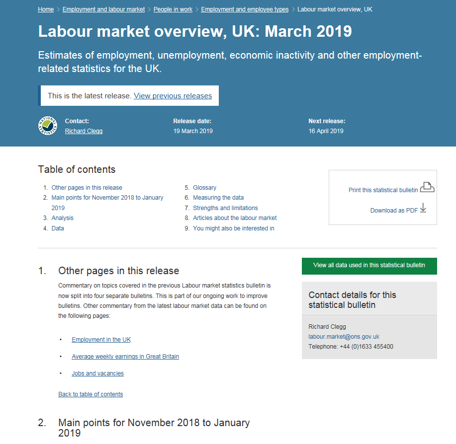
We’ve also taken the same approach in recent days splitting a single 10,000-word bulletin on all aspects of the Labour Market into a single, shorter overview (fewer than 3,000 words) and more topic focused, shorter bulletins on Employment, Average Weekly Earnings and Jobs and Vacancies.
The goal is to make information easier to find, for users to know instantly if they are on the right page without having to resort to searching within that page, and to know just as quickly if they are on the wrong page, where the information does in fact reside.
For some of our ‘power’ users this will represent the biggest change, because their muscle memory will be most well defined. But they are also the audience most likely to make the change quickly because of their frequent use of the site.
And there are clear benefits for such users also – on-site search will improve because the titling more directly relates to the content in the page, they will have to read fewer words on a page before knowing if what they are seeking is available, more consistent structure will make it easier to build new muscle memory about where to find important caveats, or to understand the methodology, or to get to deeper, related analysis.
“No site is perfect, but every site can be better.”
To return to my opening question, the successful publishing of statistics will hopefully continue to evolve as we follow this path of continual improvements and most importantly we’ll continue to be guided by users – all types of users. No site is perfect, but every site can be better.

Andy Dudfield is Chief Publishing Officer at the ONS